




































































































Key Takeaways
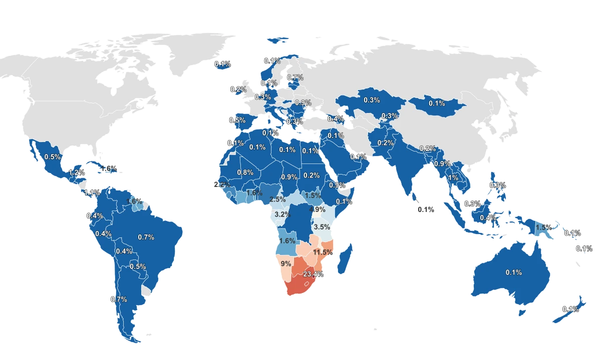
- Eswatini reports the highest adult HIV prevalence in the 2024 WHO data, with 23.4% of people aged 15 to 49 living with HIV.
- Across much of the world the figure sits at 0.1%, the lowest value recorded, shared by more than 40 countries.
- The nine highest-prevalence countries are all in southern and eastern Africa, and every one of them sits at or above 5%.
- The largest number of people living with HIV is in South Africa at an estimated 7.8 million, which is not the same as the highest rate.
What HIV Prevalence Counts, and Where the Map Concentrates
Adult HIV prevalence measures how common the infection is in a population, not how many new infections are occurring. The World Health Organization defines this indicator as the estimated number of adults aged 15 to 49 living with HIV, whether or not they have developed symptoms of AIDS, expressed as a percentage of everyone in that age group. The figures here come from the WHO Global Health Observatory for 2024 and cover 145 countries.
These are modeled estimates rather than head counts. UNAIDS and WHO produce them each year from surveillance data and household surveys, fitted with standardized estimation software called Spectrum. A higher percentage means the infection is more widespread in that population, but it does not by itself signal a worsening epidemic, because people who stay on treatment live for decades and remain counted in the figure.
The range is wide. Eswatini sits at the top at 23.4%, roughly one in four adults, while much of the world reports 0.1%, the floor of the dataset. Between those two poles, the numbers do not spread out evenly. The typical country sits near 0.4%, and most of the world clusters down at that low end, with only a short list of countries reaching the high single digits or above.
| Country | Adult HIV Prevalence (2024) |
|---|---|
| Eswatini | 23.4% |
| South Africa | 17.2% |
| Lesotho | 17.1% |
| Botswana | 15.7% |
| Mozambique | 11.5% |
| Zimbabwe | 9.8% |
| Zambia | 9.4% |
| Namibia | 9.0% |
| Malawi | 6.2% |
| Uganda | 4.9% |
Nine Countries, One Region, and the Biology Behind the Cluster
The most striking feature of the map is how few countries carry the highest figures. Nine countries report adult prevalence at or above 5%, and all nine are in southern and eastern Africa: Eswatini, South Africa, Lesotho, Botswana, Mozambique, Zimbabwe, Zambia, Namibia, and Malawi. Eswatini's 23.4% stands more than sixteen times above the global average, a wider distance from the pack than any other country in the dataset.
Epidemiologists describe these as generalized epidemics, where HIV circulates broadly through the general population rather than being concentrated in specific groups. A peer-reviewed review of the region attributes the pattern to a cluster of structural and biological factors rather than to behavior in any single country: long-term concurrent partnerships, low rates of male circumcision, untreated co-occurring sexually transmitted infections, gender inequality, and historically limited access to treatment. None of these is a moral verdict, and each is something public health programs can and do address.
One of those factors shows up directly in the data. The countries with the highest HIV prevalence are, with few exceptions, the same countries that report the highest rates of other sexually transmitted infections. South Africa, Botswana, Lesotho, and Eswatini lead both measures.
Higher HIV Prevalence Tracks With Higher STI Rates
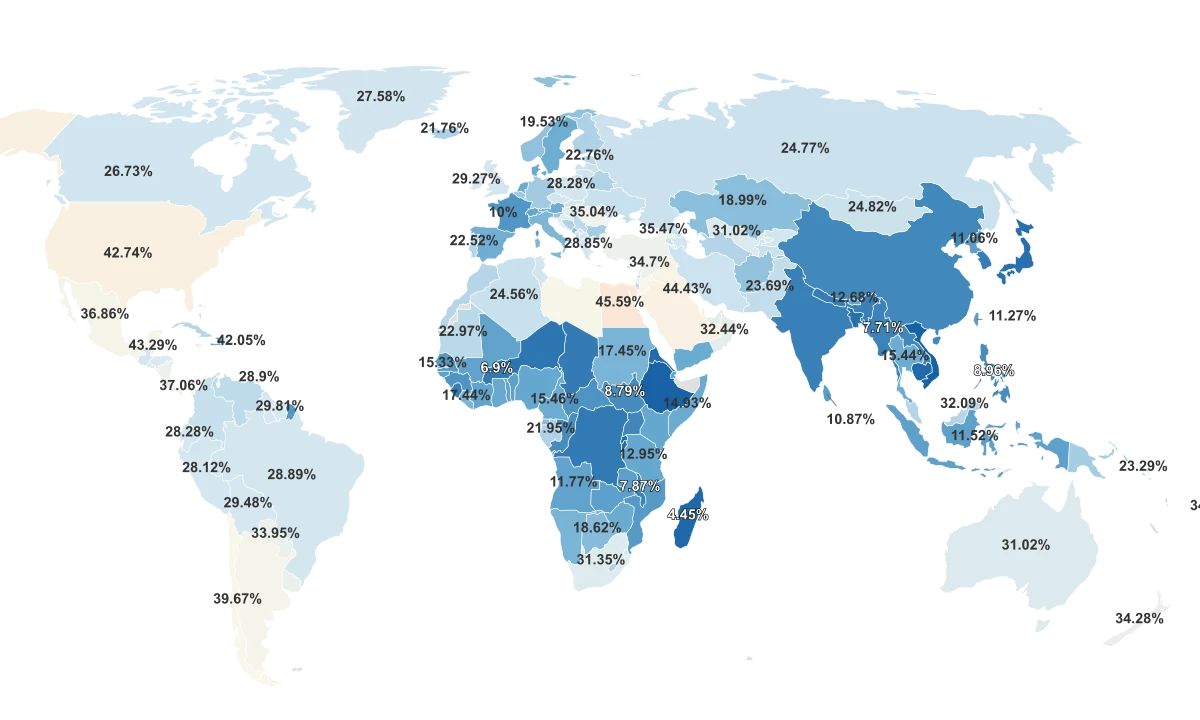
Adult HIV prevalence (2024) against reported sexually transmitted infection rates per 100,000 people. Countries high on one measure tend to be high on the other.
That overlap is not a coincidence of geography. HIV and other sexually transmitted infections amplify each other through what researchers call epidemiologic synergy: an untreated infection can breach the body's protective barriers and raise both the chance of acquiring HIV and the infectiousness of someone who already has it. Across countries, the two rise and fall together, which makes a high STI burden one of the clearest correlates of a high HIV burden rather than a separate problem.
The Country With the Most Cases Is Not the One With the Highest Rate
A prevalence map answers one question, but readers often arrive with a different one in mind: where do the most people living with HIV actually live? Those are two separate measures, and they point to two different countries. Eswatini has the highest rate, but the largest number of people living with HIV is in South Africa, at an estimated 7.8 million.
The gap between rate and count comes down to population size. Eswatini is a small country, so even a very high percentage translates into a relatively small number of people. South Africa is far larger, so a lower percentage still produces the biggest caseload in the world. The five countries with the largest caseloads together account for roughly 47% of all people living with HIV in the dataset.
The clearest illustration sits inside that top five. India has the second-largest number of people living with HIV, around 2.6 million, yet its adult prevalence is just 0.2%, near the global floor. India appears near the top of one list purely because of its population and near the bottom of the other because the infection is rare relative to its size. Reading the two measures as if they were interchangeable is the most common way the map gets misread.
Why a High Number Can Mean Treatment Is Working
Because prevalence counts everyone currently living with HIV, it behaves in a way that surprises people. A country's figure can stay high, or even rise, while its epidemic is actually improving. Globally, the rate of new infections fell by 41% between 1990 and 2021 even as the share of people living with HIV rose sharply over the same period, because antiretroviral therapy now keeps people alive and healthy for decades. A larger population living with a managed condition is, in part, a measure of treatment reaching more people.
Two further cautions help in reading the table. The prevalence figures are modeled estimates with a margin of uncertainty, not exact counts, so small differences between similarly ranked countries should not be over-interpreted. And the sexually transmitted infection rates compared here come from a different source and an earlier year than the HIV figures, and depend on how thoroughly each country tests and reports, so they describe a broad relationship rather than a precise one. The pattern across the data is clear, but the precision of any single value is not absolute.