Key Takeaways
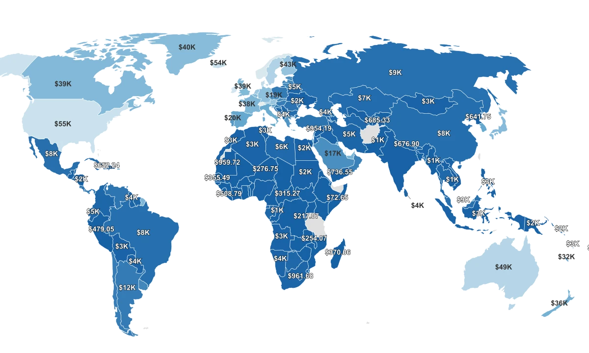
- The poorest reliably-measured country is Burundi, at about $217 of economic output per person in 2024, on World Bank current-dollar figures.
- The richest is Monaco, near $178,200 a person, roughly 820 times Burundi's figure.
- The typical country produces about $5,400 a person, far closer to the bottom than to the wealthy micro-states at the top.
- The countries clustered at the floor share a structural signature: they are overwhelmingly Sub-Saharan, landlocked, or scarred by recent conflict.
What 'Poorest' Looks Like at $217 a Person a Year
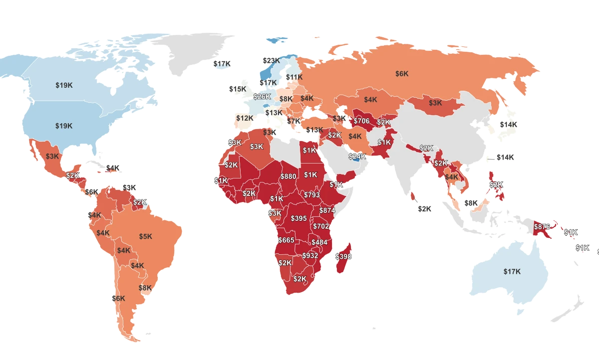
The poorest country in this ranking is Burundi, where the economy produces roughly $217 per person in a year; the richest is Monaco, near $178,200. The figure is gross domestic product per capita: a country's total economic output divided by its population, measured in current US dollars for 2024 and published by the World Bank. Because the ranking runs from low to high, a small number is the headline here: the lower the output per person, the poorer the country is counted.
It helps to know what this number does and does not capture. It is nominal, meaning it is not adjusted for how much a dollar actually buys inside each country, and it is a national average, so it says nothing about how that income is shared among people. Just above Burundi sit Malawi at about $254 and Niger at about $277. The dataset's single lowest entry, Somalia at $73, is a known bad value, since the World Bank's own figure for the country is closer to $630, so Burundi is the more reliable floor.
The middle of the table sits much lower than most readers expect. The typical country produces about $5,400 a person, and the great mass of countries falls in the low thousands of dollars rather than the tens of thousands. The wealthy economies most readers picture are not the rule; they are a short, very high tail above a crowded floor.
Why the Bottom Is Crowded and the Top Is So Far Away
The reason the average income is a poor guide to this ranking is that the top of the table is stretched almost beyond comparison. Monaco produces around $178,200 a person and Liechtenstein around $156,500, figures that sit so far above the rest of the world that no normal economy comes close. These are micro-states built on finance and favorable tax treatment, where a tiny population divides a large output, and the per-person number balloons as a result.
There is no mirror image at the bottom. A country cannot produce much less than nothing, so the poorest economies pile up against a floor near a few hundred dollars a person, separated from one another by tens of dollars rather than tens of thousands. The distance from Burundi to Malawi is about $37; the distance from Liechtenstein down to Monaco's nearest rival is measured in tens of thousands.
That asymmetry is why the average misleads. Pulled upward by a handful of extreme high earners, the mean country figure of about $14,950 sits nearly three times above the typical country's $5,400. Read the average and you picture a comfortable middle-income world; read the middle of the actual list and you find most countries far poorer than that average suggests.
A Geography of the Bottom: Conflict and the Locked-In Map
The countries at the floor are not scattered at random, and the clearest evidence is which countries have fallen over time. On the United Nations' Human Development Index, the steepest decliners since 1990 are Syria, which dropped 70 places, followed by Venezuela, Yemen, the Central African Republic, and Libya, each down about 60. Every one is a war or a state-collapse story rather than a case of slow, ordinary poverty.
The World Bank draws the same line. It identifies the Democratic Republic of Congo, Burundi, the Central African Republic, and Liberia as the only countries that have stayed continuously on its fragile, conflict-affected list since 1998, and all four sit in this ranking's poorest tier. Where fighting destroys roads, harvests, and the basic ability to collect taxes, output per person has little room to grow.
Geography deepens the trap. The UN finds that the level of development in landlocked countries runs about 20 percent lower than it would otherwise be, because shipping goods overland through neighbors costs more than double what coastal states pay. Niger, more than 2,000 kilometers from the nearest sea, is one of the poorest countries on the list, alongside landlocked Burundi, Malawi, and the Central African Republic.
Low Income Is Not the Same as High Poverty
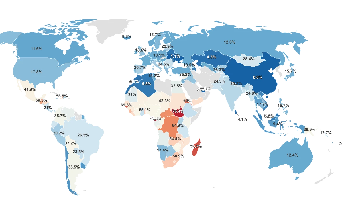
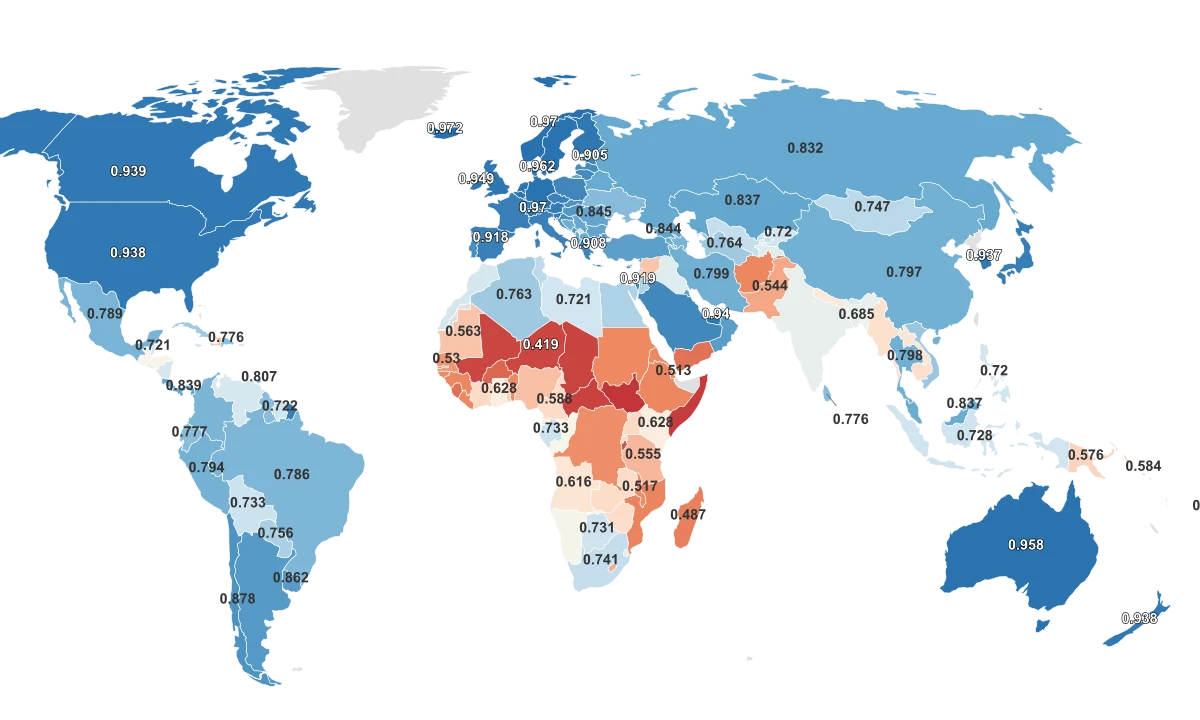
It is tempting to assume the poorest-income countries and the highest-poverty-rate countries are the same list, but the data only partly agrees. A country's broader human development moves with its income, yet explains only about 41 percent of the differences in output per person, and its national poverty rate explains even less, closer to 15 percent. The two measures point in the same direction without lining up.
The reason is in how poverty is counted. The World Bank measures global extreme poverty against a single common standard, the international poverty line of $2.15 a day in 2017 purchasing-power terms, while each country also sets its own national poverty line at a different level. A nation can post low average income yet a moderate measured poverty rate, or the reverse, depending entirely on which line is drawn and how income is spread.
That gap is worth holding onto when reading any "poorest" ranking. Per-capita output, the measure here, captures the size of the economic pie per person, but not how thinly it is sliced. A country near the bottom of this list is producing very little per head, which is a real and important fact, but it is not the same as a precise count of how many of its people live in poverty.