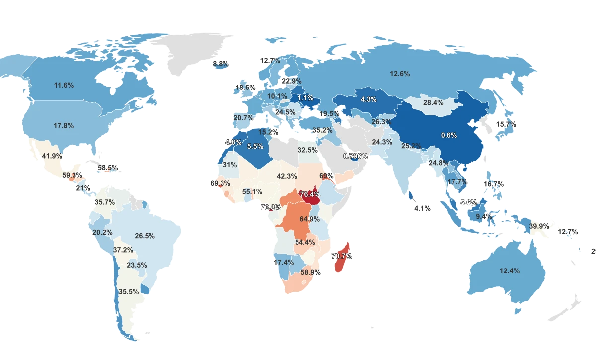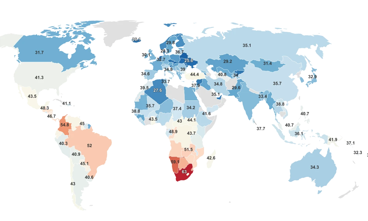
The Most Unequal Country on Earth Scores More Than Double the Most Equal
The Gini coefficient measures how evenly income is distributed across a country's population. A score of 0 means everyone earns the same. A score of 100 means one person holds everything. In practice, most countries fall between 24 and 55, but the range in the 2024 data is wide enough to separate two fundamentally different economic realities.
South Africa leads at 63, the highest Gini coefficient of any country in the dataset by a wide margin. At the other end, Slovakia sits at 24.1, and its neighbor Slovenia at 24.3. The gap between top and bottom is 38.9 points. Across 161 countries, the global mean is 36.7 and the median 35.1, meaning the distribution is roughly symmetrical: about as many countries cluster above average as below.
The most unequal countries form two geographic blocks. In Southern Africa, Namibia (59.1), Eswatini (54.6), and Botswana (53.3) all sit in the top five alongside South Africa. These are not the world's poorest countries. They are middle-income economies where the gap between the top and bottom of the income ladder is enormous.
The second cluster is Latin America. Colombia (54.8), Brazil (52), and Panama (48.9) all rank in the top 11, with Honduras (48.2) close behind. In both regions, the pattern is the same: moderate aggregate wealth paired with extreme concentration at the top.
The most equal countries are a more surprising mix. Alongside Scandinavian nations like Denmark (28.3) and Norway (27.7), the bottom of the ranking includes Belarus (24.4), Ukraine (25.6), and Moldova (25.7), countries where low inequality has less to do with shared prosperity and more to do with compressed wages in controlled or conflict-affected economies. Equality, measured by the Gini, and quality of life do not always point in the same direction.
Apartheid Ended 30 Years Ago. The Gini Coefficient Says It Didn't.
South Africa's score of 63 is not just the highest in the dataset. It is a statistical outlier, sitting 3.6 standard deviations above the global mean. No other country comes close. The next highest, Namibia at 59.1, trails by nearly four points. Together with Botswana (53.3), Zambia (51.5), and Zimbabwe (50.3), they form an unbroken band across Southern Africa where inequality has deep, structural roots.
The explanation is historical. Apartheid, South Africa's system of state-mandated racial segregation, was deliberately designed to concentrate land, capital, and educational opportunity in a small white minority. The Group Areas Act forced Black South Africans into underdeveloped townships far from economic centers. The Bantu Education Act created an inferior schooling system intended to limit Black workers to manual labor. When the system was formally dismantled in 1994, the economic architecture it built did not go with it.
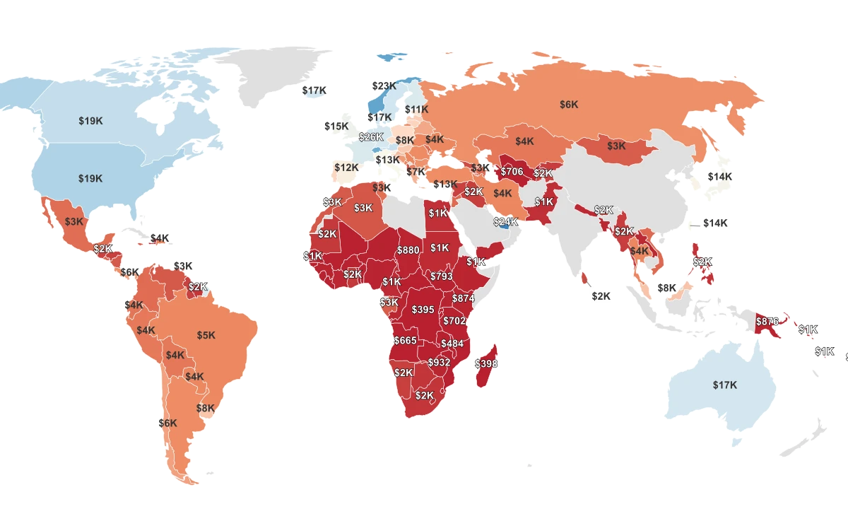
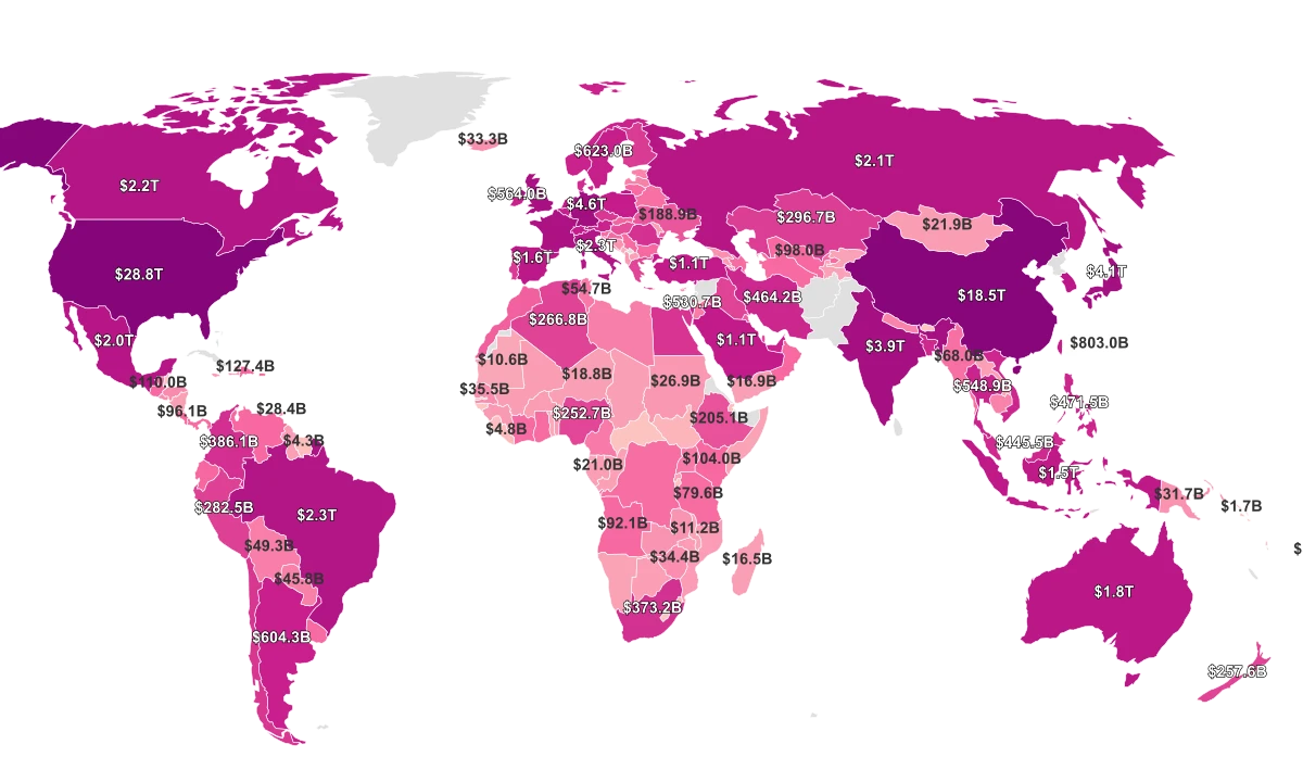
Three decades later, the International Monetary Fund describes South Africa's economy as "dualistic": a highly advanced formal sector integrated into the global economy, sitting alongside a massive, struggling informal sector. Unemployment is the primary driver of inequality today. The country's median income is just $1,624 per year, yet its GDP per capita PPP of $15,194 suggests far more aggregate wealth. The gap between those two numbers is the Gini in action: the average is pulled up by a small, wealthy population while the median reflects where most South Africans actually live.
Most of the World Got Slightly More Equal, but Not Everywhere
Gini Index change from 2018 to 2024. Colombia and Mali became less equal while Central African Republic and Benin improved significantly.
Showing 51 of 156 regions · Sorted by: Highest to Lowest · 105 not shown
Namibia's story is closely linked. It was administered by South Africa under apartheid-era policies until independence in 1990. Its Gini of 59.1 reflects the same structural inheritance: concentrated land ownership, racial economic stratification, and a dual economy. Namibia's poverty rate is just 17.4%, far lower than South Africa's 55.5%, but the income distribution remains among the most lopsided on earth.
The United States Is More Unequal Than Every Country in Europe
The United States scores 41.3 on the Gini Index, placing it 38th out of 161 countries. That puts it above every European nation in the dataset, including Bulgaria (39), Lithuania (36.7), Italy (34.8), the United Kingdom (32.4), Germany (32.4), and France (31.5). The Scandinavian countries sit in the mid-to-high 20s.
This is not because the United States is poor. It has the 5th highest median income in the dataset at $19,306 and one of the highest GDP per capita figures in the world at $82,769. The issue is how that wealth is distributed. Research from Imperial College London has found that the primary driver of the US-Europe inequality gap is pre-tax income disparity: the return to high-skilled work is dramatically larger in America than in Europe, creating a wider earnings chasm before any redistribution occurs.
National Wealth Does Not Predict Equality
Countries with higher median incomes tend to be slightly more equal, but the United States is a dramatic exception: wealthy and unequal at the same time.
The stock market amplifies this. Wealthier Americans are far more likely to hold equities than lower-income households, and the outsize growth of the U.S. stock market over the past two decades has concentrated asset gains at the top of the distribution. European countries offset much of their market inequality through redistribution: universal healthcare, subsidized childcare, and strong unemployment insurance function as a "social wage" that compresses disposable income even when pre-tax earnings are unequal.
The United States is the only high-income country in the world without universal health coverage. Access to healthcare, education quality, and economic mobility are all more tightly linked to personal income in the U.S. than in Europe. The Gini coefficient captures the result of those structural choices: the same economy that produces the world's highest median incomes also produces an income distribution closer to Latin America than to Western Europe.
Low Inequality Does Not Always Mean Shared Prosperity
Belarus is the third most equal country in the dataset with a Gini of 24.4. It is also an authoritarian state where wages are tightly controlled by the government and independent labor unions are effectively banned. Ukraine (25.6) ranks 4th most equal: a country mired in active conflict, where the economic compression has more to do with wartime conditions than with progressive policy. Low Gini is not the same as a good outcome.
The World Bank notes this explicitly: the Gini coefficient measures relative inequality, not absolute welfare. A country where everyone earns $500 a year will score the same as a country where everyone earns $50,000. The metric captures how evenly the pie is divided, not how large the pie is. Slovakia (24.1) and Slovenia (24.3) achieve their low scores through a combination of post-communist egalitarian structures, high home ownership rates from 1990s-era privatization, and robust social spending. Their equality reflects genuine shared prosperity. Belarus's equality does not.
China illustrates another blind spot. Its poverty rate in the dataset is just 0.6%, the lowest of any country. But China's Gini is 35.7, firmly in the middle of the pack. The discrepancy is partly definitional: China's national poverty line and the methods used to measure it produce a lower threshold than international standards. The Gini, being relative, captures the inequality that the poverty rate's absolute threshold conceals.
The deeper limitation is structural. The Gini coefficient compresses an entire income distribution into a single number, which means two very different societies can produce the same score. A country where inequality is driven by an extremely wealthy top 1% will look identical, by Gini alone, to a country where inequality is driven by a very poor bottom 20%. Economists increasingly recommend supplementing the Gini with other measures, including top income shares, wealth distribution, and access to public services, to understand what inequality actually looks like on the ground. The number is a starting point, not a verdict.